
Opening the core TradeSkillMaster Dashboard can be done by clicking on the TSM icon around your minimap, or typing /tsm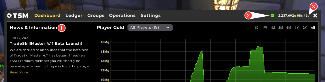
-
News & Information
This section on the left will display the latest Blog Post entries from the TSM website.
-
App Sync and Price Data Status Icon
This icon will be coloured Green, Yellow, or Red depending on the status of your Desktop app sync, or the age of your pricing data. Mousing over the Status Icon will display the realm you are currently connected to, and the last time your game synced to the TSM Desktop app - and how old your price data is if the game has synced to the app. Note: Your app can sync more frequently than pricing data is updated. This is normal!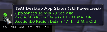
-
Gold Count
This will show your current gold count on the character that you're logged into. Mousing over this gold count will show your total gold across all characters on the same realm and faction.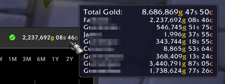
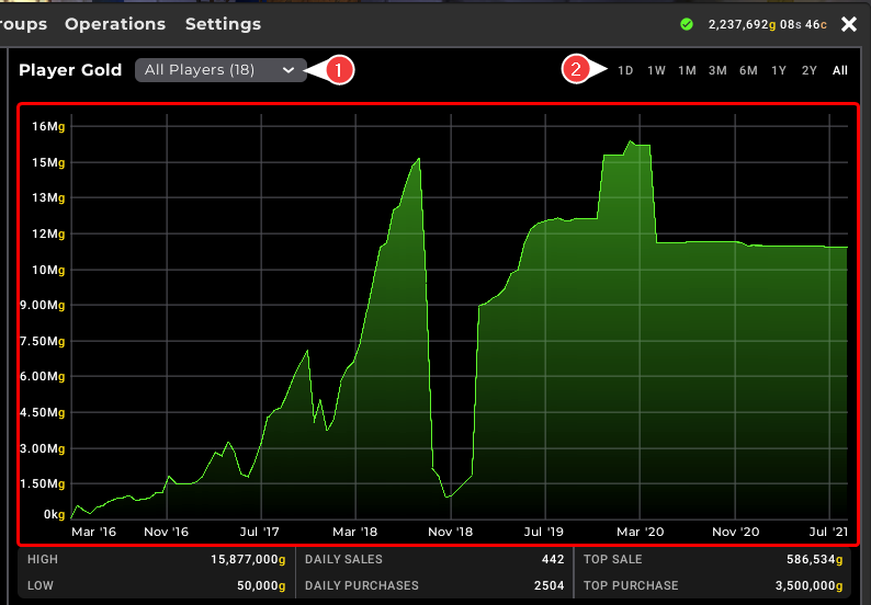
The Player Gold Chat in the Dashboard is a record of the total gold on-hand across the characters selected in the dropdown marked (1). You can filter the chart in two ways, firstly by selecting the pre-defined timeframe as marked (2), or by left-clicking on the chart area and dragging from the desired starting and ending point. After doing so, there will be a 'Reset Zoom' in the top right.
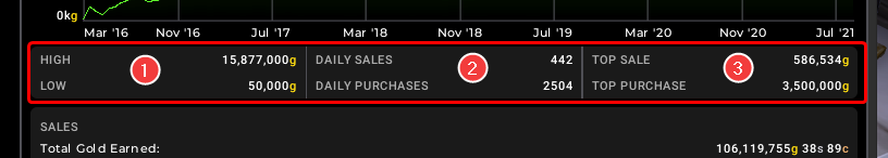
In the middle of the Dashboard, we can see three sections highlighting some high level statistics in relation to your Ledger data and is dynamic to the time range selected in the main Dashboard chart.
- Section One (1) shows your highest and lowest gold values for the time range displayed in the Chart.
- Section Two (2) shows your average number of sales and purchases for the time range displayed in the Chart.
- Section Three (3) shows your highest individual sale and purchase within the time range displayed in the Chart.
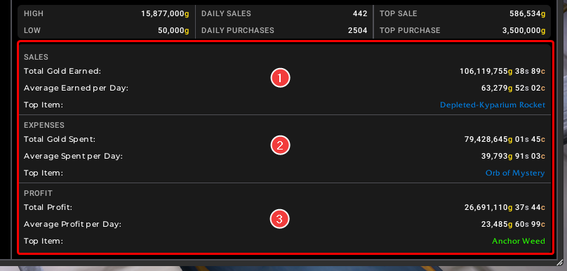
At the bottom of the main Dashboard we can see a further three sections highlighting Sales, Expenses and Profit statistics and is dynamic to the time range selected in the main Dashboard chart.
- Section One (1) shows the total gold, and average gold earned per day for the time range displayed in the Chart. The Top Item is the item with the highest overall/total revenue in your Ledger for the time range displayed in the Chart.
- Section Two (2) shows the total gold, and average gold spent per day for the time range displayed in the Chart. The Top Item is the item with the highest overall/total purchase price in your Ledger for the time range displayed in the Chart.
- Section Three (3) shows the total profit, and average profit per day for the time range displayed in the Chart. The Top Item is the item with the highest overall/total profit in your Ledger for the time range displayed in the Chart.